Why Is Packaging Artwork a Key Part of Brand Marketing Strategy?
Recent Posts
-
 Everything to Know About Manila... March 31, 2026
 -
 Mushroom Chocolate Packaging Guide for... March 30, 2026
 -
 What Is the Standard Shoe... March 26, 2026
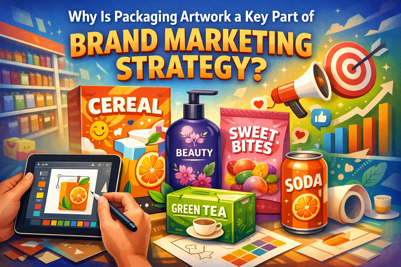
Think of your favorite brand and tell what was the first thing that came to your mind? Was it their mission statement or did you picture their box? We bet it was the box. This is the power of a beautifully designed custom box. Study shows that visuals are 60,000 times more effective at conveying information instantly than text. Thus, making your promotional packaging artwork the most efficient communication tool in your marketing arsenal.
Digital ads are often scrolled past while emails are deleted. But a custom box sits on the kitchen counter, the vanity, and the desk where its colors, typography, and spatial hierarchy acts as a permanent billboard for your brand’s values. Moreover, a well-designed package sets the product apart and reduces decision-making efforts for the customers. Therefore, let your artwork speak and make it the voice of your brand. Read this blog to explore the importance of promotional packaging artwork and how it serves the multidimensional job of visibility, differentiation, and emotional connection.
Why your promotional packaging artwork matters more than you think
Packaging art is a planned design tool that targets the market. It is used to enhance both the business and the product. It’s tempting to think of artwork as the “final coat of paint,” but in reality, it is the backbone of your product’s identity. If the product is the “what,” the promotional packaging artwork is the “why”. Confused! Let us walk you through the magic of artwork as a marketing strategy.
It’s the first impression of your product
In the retail world, your product doesn’t get a second chance to make a first impression. This split-second window is known as Shelf Impact. A well-designed artwork helps brands to grab this opportunity and rule the shelf with its vibrant colors, sleek typography, and sharp imagery. Color, typography, and graphics are design elements that act as a psychological shortcut. For example, colors are emotional triggers that communicate brand identity and influence the customer’s purchasing decision. Like the color red stimulates appetite and urgency. That’s why world’s leading food brands such as KitKat, Doritos, KFC, Burger King and Coco Cola use this color. It’s their marketing partner.
When you are not around, your artwork does the talking. Through color theory and compelling graphics, it answers the consumer’s three most urgent questions:
- What is this?
- Why should I care?
- How will it make me feel?
Thus, leaving the customers with a “must-have-now” feeling.
It communicates brand values and storytelling
Now-a-days people don’t buy products, they are buying into identities. Here is the problem, how to convey brand narrative without saying a word? Because honestly no one has time to read long texts to know what the brands stand for. This is where the packaging artwork enters, your visual narrative. It has the ability to bypass the analytical mind and speak directly to the gut. You don’t need a sprawling paragraph of text to explain that your brand is “cutting-edge” or “nature-focused”.
In simple words, artwork is a design language that acts as “codes” for customers to decipher. For instance, if you are a brand who wants to deliver its commitment to the planet. Then pair organic, coarse textures of Kraft, jute, or hemp with soft, muted terracotta and green hues while using subtle ink printing. This functional, eco-friendly design will speak for itself and convey your brand’s responsible image.
It ensures compliance, trust, and legal integrity
While marketing is often about emotion and storytelling, there is a pragmatic side to packaging that can make or break a brand. It’s the legitimacy. Your promotional packaging artwork is the final filter through which your brand proves it is professionalism and compliance.
Every industry has its “must-haves”. Like the food, cosmetics, and pharmaceutical sector have to follow FDA standards. Then there are regulatory packaging symbols, QR codes, or standard barcodes. Treating these features as an afterthought and applying them haphazardly make the product look cheap and suggest a business is untrustworthy. However, promotional packaging artwork treats these elements as cohesive components of the design. When a QR code is framed beautifully or a barcode is placed with precision, it tells the consumer that the brand is organized and transparent. It also proves that the brand follows the rules of the law while maintaining the rules of high design.
It forces brand recall
In a world where consumers are bombarded with thousands of marketing messages daily, the goal isn’t just to be seen. It’s to be remembered. With promotional packaging artwork you can achieve this by creating a “visual shorthand” that lives in the consumer’s long-term memory. Because it contains your signature logo, a specific color palette, a unique pattern, and a consistent layout. This visual repetition makes it easier for a customer to find you again in a crowded aisle. They don’t need to look at the price tag, just a flash of your brand’s color already told them who you are.
In short, a packaging’s artwork makes your brand familiar, memorable, and boosts repeat sales.
Essential steps for printing flawless packaging artwork
Moving from a digital concept to a physical box is where many brands stumble. To ensure your packaging artwork looks as good in your hands as it does on your screen. Then follow steps in the presentation packaging guide that we are sharing with you.
- Work in CMYK not RGB: Digital screens use RCB color model. As a result when you print your artwork, there might be some color variation. Therefore, set your graphic file document color mode to CMYK. You’ll get perfect color accuracy.
- Use vector graphics for everything: Your logo, illustrations, and icons all should be vector-based. Vector images can be scaled to any size, they won’t pixelate.
- Account for “Bleed” and “Quite Zones”: There is a minor risk that your paper or cardstock may experience slight misalignment during cutting. Therefore, please ensure a minimum 3-5mm safety margin from the trim and fold lines
- Outline your fonts: Before printing your artwork create outlines of your font. In this way your typography will look exactly the same as you intended.
- Set your resolution to 300 DPI: If you are using non-vector images. Then verify the resolution of your images are set at 300 DPI or higher. Going lower will create poor-quality and unpolished visuals.
- Call out “Spot colors”: For those who don’t know, spot colors are pre-mixed inks used in printing. They are a feature of Pantone Matching System (PMS) and deliver 100% color accuracy. So, if your brand has a specific color like a Tiffany blue, go for spot colors rather than CMYK model.
Conclusion
At its core, packaging artwork is the only marketing channel with a 100% open rate. By leveraging your artwork as a strategic tool rather than merely a decoration, you don’t just pack a product. But you tell a story, justify a premium price point, and build a captivating first impression with your audience. So if you want unique and amazing art print packaging ideas for your custom product packaging boxes, contact Boxit Packages. We manufacture the best custom packaging boxes in the US and have the most talented team of graphic designers. They can create bold, colorful, and enticing artwork designs for custom boxes. You can visit our website to review our incredible collection. Our design assistance is free, so contact us without any further delay!
.jpg)