Pantone vs CMYK Which is Better for Custom Branded Packaging
Recent Posts
-
 Rise of Exotic Weed Bags... March 4, 2026
 -
 The Ultimate Guide to Printing... March 3, 2026
 -
 Cigarette Prices across the US... March 2, 2026
You splurged on a thousand dollars of custom packaging to make your dream box a reality. But unfortunately the desired outcome was not achieved. Your brand signature blue box is now a murky, purplish mess. Well, there could be several different reasons for this mishap. Like the compatibility of the paper’s surface with color. The impact of final finishing on the color’s appearance. However, the major cause is the difference between the screen and print color modes due to the selection of the wrong color system. Choosing the wrong color system not only leads to color shifts between batches. But it also results in poor print quality, unexpected and wasted cost, and most importantly tangible loss of brand identity. To save your custom boxes from color disaster, you need to understand the difference between color models. In this blog we have focused on Pantone color vs CMYK. Read it to explore the difference.
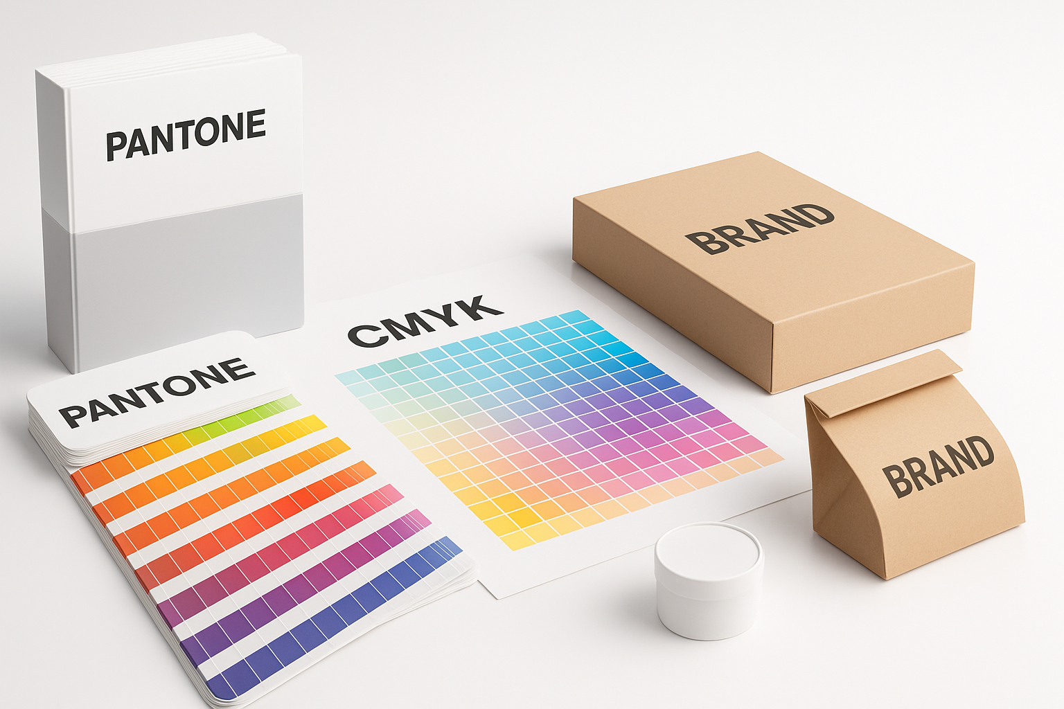
Understanding the color systems “Pantone color vs CMYK”
The key to ensure your colors are always spot-on lies in the selection of the right color model. Although there are four color-matching systems (RGB, HEX, Pantone, & CMYK). But only Pantone and CMYK dominate the printing industry. Let’s find out how the two systems work and which one is the best suited for your specific design and printing needs.
What is CMYK?
CMYK is also known by the name “Process color” or “Four Color Printing”. This color system uses four inks in the printing process.
- Cyan (a bright blue-green ink)
- Magenta (a purple-red ink)
- Yellow
- Key (black ink)
It is a subtractive color model. This means it produces colors by reflecting light off the surface. The CMYK system is often confused with the RGB model. However the two models work on totally different mechanisms. In CMYK, inks subtract light from white background. Whereas in RGB the light is added to black surface. The CMYK color model is a cost-effective method, therefore, it is suitable for mass production. Also, if your custom retail printed boxes are designed with gradients, intricate patterns, and complex graphics. Then, CMYK is the ideal solution. However, there are two sides of every coin. There are certain limitations, too. It is unsuitable for highly vibrant and fluorescent colors. Plus, it is inconsistent with certain paper types. Such as colored, dark, and highly absorbent uncoated papers.
What is Pantone?
Pantone color model is a proprietary color system used for printing consistent patterns, images, and color schemes across different materials. Unlike a CMYK method, an ink mixing process, in Pantone a solid color is printed using a pre-mixed ink. These pre-mixed inks are coded with a unique number which makes it easy to get the same result every time. Thus, this system works on multiple substrates like fabric, paper stock, and many more.
The key strength of the Pantone system is color consistency. For example, orange in CMYK can sometimes appear a little brownish. However, Pantone will create the exact shade. Additionally, it works wonders with specialty inks and produces highly vibrant results of metallic and neon colors. But it has a higher set up cost due to the specific printing unit, pot, and plates.
Converting CMYK to Pantone
CMYK is an approximation whereas Pantone is a guarantee. Thus, from the above analysis of Pantone color vs CMYK, it is apparent that PMS color models offer superior color consistency across various materials. So isn’t it better to convert CMYK color specifications into Pantone spot colors?
Well, there is no such printing machine or converter for conversion pantone to CMYK and vice versa. Because both the models are completely different from one another. As one is the ink mixing process to produce desired results. Whereas the others use pre-mixed inks to print solid colors. However, designers often use software and online tools for conversion of these two models. You can use:
- Adobe Photoshop
- Adobe Illustrator
- Easy RGB
- My Creative Shop
- Pantone Color Finder
“Pantone color vs CMYK” Which is the best for branded packaging?
Picking one color model over the other is difficult. Because neither is universally “The Best”. For branded packaging boxes there are certain factors that determine the color model. Such as your design complexity, volume of custom boxes, color consistency. Therefore, to decide between the two, let’s explore the pros and cons of printing pantone vs CMYK.
Choose Pantone when:
- There are no exceptions to brand consistency. Yes, your logo and artwork is your brand signature. They must be identical on packaging or website to increase brand recall. Therefore, any color variation in the elements is non-negotiable.
- Your packaging’s design includes metallic effects or fluorescent colors.
- If you are working with difficult substrates such as corrugated cardboard or PP, PE, TPE, and ABS plastics.
Choose CMYK when:
- Your custom boxes are designed with intricate artwork and images that require full-color printing.
- You want to manufacture eco-friendly packaging. CMYK offers sustainable inks, too.
- You need to place bulk orders as it is economical for large volumes.
“Uncoated vs coated pantone” Which one is better?
There is no doubt that if your packaging demands full-color printing, then CMYK is the answer. And for perfect color consistency and metallic sheen, Pantone is the champion. So once you decide your color model, the next agenda is choosing the printing surface. Because pantone colors are defined by paper type. Coated and Uncoated. Coated pantone colors are used for coated papers for glossy, lavish finish. Whereas the uncoated pantone colors are used on uncoated papers for a matte look. You can also use both types of colors on the same paper stock. But do check the paper’s compatibility before printing.
Combining Pantone and CMYK “The Hybrid Approach”
Pantone is quite expensive due to its high step up cost. On the contrary, CMYK is economical for printing intricate patterns and complex designs. When precision, consistency, and affordability is at question. Then integrating the two color models is the best approach. You can use Pantone for printing logos and CMYK for other features such as graphics and text.
Conclusion
Pantone color vs CMYK is a long debate. Choosing the right one depends on the features and volume of branded packaging. Reading the above blog can help brands to make the informed decision when it comes to picking color models. At Boxit Packages, we provide free consultation and assistance for packaging design. Therefore, if you have any concerns regarding the printing methods, color models, and packaging design. Get in contact with us through our customer care service. We will provide you with the best solutions for your Kraft boxes with windows.
.jpg)
