What Is a PMS Color? A Complete Guide to Understanding It
Recent Posts
-
 Mushroom Chocolate Packaging Guide for... March 30, 2026
 -
 What Is the Standard Shoe... March 26, 2026
 -
 What Is Glassine Paper? Uses,... March 25, 2026
You have squandered your money, time, and resources on ‘test print’ trying to get a color look ‘just right’. Yet your brand’s signature blue looks more like a dull purple. What do you think, where are you making a mistake? Well, the problem lies in your color language, you are still stuck with the old CMYK color model. Although this model is ideal for ink layering and subtractive color, it lacks color accuracy. That’s where PMS color saves the day. Every time you decide to go for neon orange, metallic gold or cherry red, PMS makes sure your shade stays the same as on the digital file. Moreover, it ensures your brand looks identical whether it’s on a custom box, business card, or billboard.
Therefore, to avoid color variance or shifting in the future let’s find out more about the PMS color model. In this blog, we will explore what PMS color is, how this model works, what are its applications and why it’s the secret weapon for professional branding.
What exactly is the PMS color model?
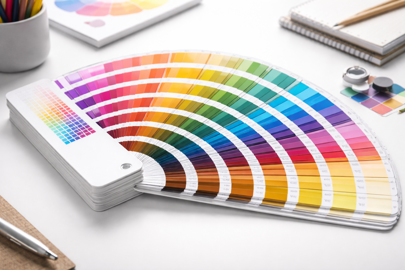
PMS, known as Pantone Matching System, is the universal color language. This color model is used by professional designers and printers. Unlike CMYK that works on the layering four basic inks principle, PMS takes the ‘color coding’ approach. The code helps printers and designers match colors exactly. Each single hue in the Pantone library is assigned a standardized number to ensure that the ‘identity’ of that color remains immutable regardless of who is producing it. For example, “PMS 186 C” will always be a ‘scarlet red’ whether it’s used by a beauty brand in the US or a local shop in any other continent.
Thus, by choosing a PMS standardized color scheme, you get to remove the human element of ‘eyeballing’ a color and protect your brand’s visual identity.
The evolution of Pantone Matching System
The PMS color model was introduced due to a simple but costly problem that is “Color is subjective”. Lawrence Herbert, an employee in a commercial printing company noticed that “Red” meant something different to every designer and printer. In 1963, he leveraged his chemistry background and developed a system of standardized ink formulas. Now designers don’t have to make wild guesses about the color in fact they could provide a three-digit color code. This model started as a tool for 40 colors and today there are more than 15,000 colors in the PMS library. Since then this system has remained the world’s most influential language for color communication.
Understanding the Pantone Matching System (PMS)?
To figure out this model, you must know how its standardized color scheme works. So basically this system works by standardizing the chemistry of ink. Unlike digital screen (RGB) or CMYK color models which create colors by mixing light or layering four basic inks. PMS uses pre-mixed “Spot Colors”. The purpose of spot colors is to achieve precise, consistent, and vibrant colors for branding and designs needing solid, uniform color areas. Let’s see how these spot colors create a specific color.
Ink mixing techniques and tips
This entire system is built upon a foundation of 18 basic pigments which include Violet, Reflex Blue, Rubine Red, Yellow C, Process Blue, Transparent White, Metallic Bases, and many others. To create a certain shade printers follow a highly specific “recipe” provided in a Pantone Formula Guide. For example, to create a Pantone 360 C ‘vintage green’ the guide instructs the printer to mix 52.5% Pantone Yellow and 47.5% Process Blue for the exact result.
Decoding the suffixes C vs. U
While reviewing the formula guide, you’ll notice identical color numbers appearing twice but differentiated by their letter “C and U“. Actually C and U are the suffixes that indicate how a color will behave on coated vs. uncoated paper. For instance C stands for “Coated paper” and pantone color with C suffix means these colors will look vibrant and highly saturated on glossy stocks. Similarly U stands for “Uncoated Paper” and these colors appear muted and dark on standard letterhead or envelopes.
The Pantone color palette guide
Up till now we know that the PMS model comes with a wide range of colors that are coded by a standardized number. However, these colors are categorized into four palettes based on the material, application, and printing method. Also it is helpful for delivering accurate and captivating results. The PMS color palettes are:
- Pantone solid palette
- Process palette
- Textile palette
- Geo/Plastic Palette
There are other subsets within the PMS system too that include metallic, neon, and pastel colors.
“PMS vs. CMYK vs. RGB” Know the difference
Understanding the difference between these three models is the key to avoid “color shock: when moving from a design software to a finished product. Because each system has a different color language and serves a different purpose.
PMS vs. CMYK
CMYK differs from the PMS color model in its color mixing process. It uses four-color (Cyan, Magenta, Yellow, Black) process layering for full-color images. Only these four inks are mixed, that’s why most of the time the shades are not perfect. It does not give a solid ink match, however, can produce detailed images and sharp photos. For better color accuracy, printing logo, and brand colors PMS is the best. Also, you can convert CMYK to Pantone color to ensure superior color consistency across different printers, materials, and production runs.
PMS vs. RGB
RCG stands for Red, Green, Blue. It is a light-based model and is designed for screens like phones, laptops, and television. This means RGB looks bright on screens and doesn’t work for printing. For real ink colors use Pantone matching System.
Why does your business need a PMS color?
The Pantone Matching System is considered the ‘gold standard’ of the printing world. Although it is a little more expensive than standard digital printing, its benefits for brand owners and designers far outweigh the initial investment.
Here are a few advantages that your brand can avail by using this model.
Unmatched color consistency
A quite prevalent issue with other color models is the color drifting due to printer’s limitations or conversion between different color spaces. Pantone eliminates the color drifting by using a standardized numbering system and specific ink formula. It ensures that colors appear identical across various mediums (e.g., paper, packaging, fabric), preventing brand dilution. Thus, pantone plays an important role in building brand trust and recognition.
Access to “Unprintable” colors.
Standard CMYK printing has a limited range of colors. If you want to color your branded product packaging boxes or business cards with bright orange, vibrant green, or deep purple, there is a 90% chance of color variation. However, PMS allows the use of colors that are physically impossible to create with the four-color process. This means you can add neon, fluorescents, and metallic shades to your custom packaging boxes.
Precision on different materials
Although CMYK has a good compatibility with different coated and uncoated papers, the colors appear different on each. Whereas PMS allows designers to compensate for how different materials absorb ink. So, by using Pantone you can specify a color code with desired suffixes (C and U) to ensure your logo looks exactly the same whether it’s a glossy magazine page or a custom cardboard box.
Professional print quality
CMYK relies on “halftones” also known as tiny dots whereas PMS inks are solid. As a result your typography looks sharper because it is printed with a solid block of ink. Also, the large areas of a single color look even and saturated.
Cost and time efficiency
PMS inks are popular for their resistance to fading and ability to hold up on diverse materials. This reduces the risk of, and costs associated with, reprints and error associated with color inconsistency.
Conclusion
Color consistency shouldn’t be a gamble. Whether you’re a startup defining your first logo or an established business refreshing your look, the Pantone Matching System is the gold standard for precision. From neon’s and metallic to the perfect corporate navy, PMS provides the tools to ensure your vision translates perfectly from screen to substrate.
If you have other queries regarding Pantone Matching System then contact us. Our company also provides PMS color samples to guarantee the red ink, aqua green, or metallic gold is vibrant and consistent.
.jpg)